
In a previous post, we introduced the No Barriers project and our partnership with Kris Foster and Isaac Harvey MBE. We said we’d share every step of this journey, bumps and all. Here’s what’s happened since we last updated you.

The story so far
We’ve now run our first two sessions together, one focused on onboarding, the other on voice interaction and dyslexia-friendly design. Both were eye-opening. And both confirmed something important: when you involve people with lived experience in the design process, you don’t just find accessibility issues. You find things that affect everyone.
Onboarding: seeing what we couldn’t see
Our first session wasn’t a simulation. We were watching as Kris set up a genuine sole trader account for his emerging consultancy and media business, with Isaac observing and contributing throughout. It was scheduled for 60 minutes. It ran for nearly three hours.
That length tells you something in itself.
Kris is a motivational speaker, podcaster and content creator. He’s autistic, has Down’s syndrome, is dyslexic, dyspraxic and has ADHD. He uses voice-to-text for virtually all input and relies on tinted backgrounds and broken-up text to help him process and understand written content. His daily workaround for reading documents involves screenshotting text, pasting it into Notes, and having it read aloud, repeatedly, until it sticks.
What emerged wasn’t a list of minor niggles. It was a pattern of friction that would affect anyone starting a business for the first time, but one that hits hardest for people who’ve spent a lifetime being told the problem is them.
When Kris reached the business category selection, none of the options reflected what he actually does. He could see fragments of himself across three categories ("Education", "Consultant, contractor or specialist", "Arts entertainment and recreation") but could only pick one.
“I can’t place myself,” he said. “And if I was by myself, I would have come out, purely on the basis that I felt uncomfortable.” He was clear that this isn’t just a disability conversation, it’s about anyone whose work doesn’t fit a traditional mold. A podcaster. A portfolio worker. A YouTuber. The categories assume a conventional business model that increasingly doesn’t exist.

Visual presentation was a persistent barrier throughout. Tinted backgrounds were dramatically easier for Kris to read. When the interface switched to white for later steps, the cumulative effect - inconsistent styling, dense text and complex decisions - left him overstimulated and needing to stop. “Simple little things can make massive differences,” he told us.
Perhaps the most powerful moment was when Kris saw a message saying his account check could take up to two working days. His response was immediate: “I’ve already written it off.” Not because of the words on screen, but because of a lifetime of encountering systems that weren’t built for him and the resulting assumption that he’d get turned down. “I’m a 47-year-old man who has been rejected all of his life. So reality, it’s just another day.”
In practice, the check took minutes and the account was approved, but the messaging had already done its damage.
Isaac confirmed he couldn’t complete the ID selfie verification step independently due to his disability, his mother had to help take the photo. Without someone available, he said, he simply wouldn’t have signed up.
These are the things you only discover when you watch real people using your product for real. Not in a lab. Not with personas. With someone who has something at stake.
Voice and dyslexia-friendly design: two perspectives, one product
Our second session explored how Kris and Isaac use voice in their daily lives, and what it could mean for ANNA. What became clear immediately is that they each have fundamentally different relationships with voice, and both need to be designed for.
For Kris, voice is everything. WhatsApp, notes, emails, working with AI - all voice. He’s trained ChatGPT to write in his style and uses it as what he calls a PA for every aspect of his work. When asked if there are situations where he’d avoid it, his answer was straightforward: “I use voice for everything.” He explained that for someone who’s dyslexic, written text can be misread, tone gets lost, context gets scrambled. Voice removes that ambiguity. “It’s very black and white. There’s no grey areas.”
For Isaac, voice is more selective. He prefers typing for anything complex because he needs time to process information visually. But for actions - making a payment, pulling up a statement, quick factual questions - voice makes sense. He was clear that he’d want to see text on screen alongside any voice interaction, not just a floating animation.
Both agreed on one thing: there should be a toggle. Let people choose. That word, ‘choice’, came up again and again across both sessions.
It came up when we explored background colours for our chat interface redesign too. Stuart Tayler, our Product Design Lead, had prepared several options to test. Kris was immediate with his observation that warm, off-white tones were dramatically easier to read.
When he spotted a pure white text input field in one of the designs, his response was instant: “That’s not going to work for me.”
This led to a conversation about accessibility overlays, those toolbar widgets some websites bolt on as an afterthought. Both Kris and Isaac were unequivocal. “It goes back to what I’ve always said,” Kris told us. “It’s a thought after, rather than it being built in.” Isaac added that most people in the disability community would say overlays don’t actually make your site accessible, it needs to be in the foundations.
But here’s the thing Kris said that’s stayed with us. If ANNA offered a simple choice between a standard view and a dyslexia-friendly view, he believed most people would leave the accessible version on. Because it’s just easier. For everyone.
That’s the curb-cut effect we talked about in our first post. And we’re seeing it play out in real time.
Why this approach matters
Two sessions in, the thing that strikes us most isn’t any single finding, it’s what this way of working reveals that conventional research doesn’t.
When Kris apologised for struggling with a screen, and then caught himself, “It’s my vocab. That’s the disabled conversation again, isn’t it? Default word. Sorry and thank you”, that’s not something a survey captures. When Isaac matter-of-factly explained he’d have given up on signup entirely if no one had been around to help, that’s not something a heuristic evaluation (a systematic evaluation of how user-friendly something is) finds.
Kris described AI as having given him “a new lease of life”, not as a productivity hack, but as genuine accessibility infrastructure that lets him be authentically himself in his work. That reframing changes how we think about every AI feature we’re building.
This is what happens when you start as you mean to go on, in genuine collaboration, learning from each other, and making an immediate impact on the product. The background colour work is already being incorporated into our chat interface redesign. Onboarding findings are being reviewed with our product and design teams. Kris is sending us guidance on dyslexia-friendly fonts. The voice research is shaping requirements for a prototype our engineers are excited to build.

What’s next
We’re planning our next usability testing session with a participant who has visual impairment, which will bring a completely different perspective to how our text-heavy interface works. We’re also scheduling a voice prototyping session with Kris and Isaac, where we’ll start shaping what voice in ANNA could actually look and feel like.
And we’ll keep sharing it all here. The good stuff, the uncomfortable stuff, and everything in between.
If you’d like to follow along, share ideas, or get involved, get in touch at nobarriers@anna.money.
Read the latest updates

![What Is the Threshold for Making Tax Digital? [Guide]](https://storage.googleapis.com/anna-website-cms-prod/small_cover_3057_f0f2ffd268/small_cover_3057_f0f2ffd268.webp)


![Making Tax Digital for Freelancers [Complete 2026 Guide]](https://storage.googleapis.com/anna-website-cms-prod/small_cover_3000_25_15d6713572/small_cover_3000_25_15d6713572.webp)
![How to Sign Up for Making Tax Digital [A Detailed Guide]](https://storage.googleapis.com/anna-website-cms-prod/small_cover_3031_86f7f6f18a/small_cover_3031_86f7f6f18a.webp)
![MTD ITSA for Landlords [+6 Software Options Compared]](https://storage.googleapis.com/anna-website-cms-prod/small_cover_3025_77131ed4c8/small_cover_3025_77131ed4c8.webp)
![How to Choose the Best MTD Bridging Software [+Comparison]](https://storage.googleapis.com/anna-website-cms-prod/small_cover_3000_22_ba8f9dee9d/small_cover_3000_22_ba8f9dee9d.webp)


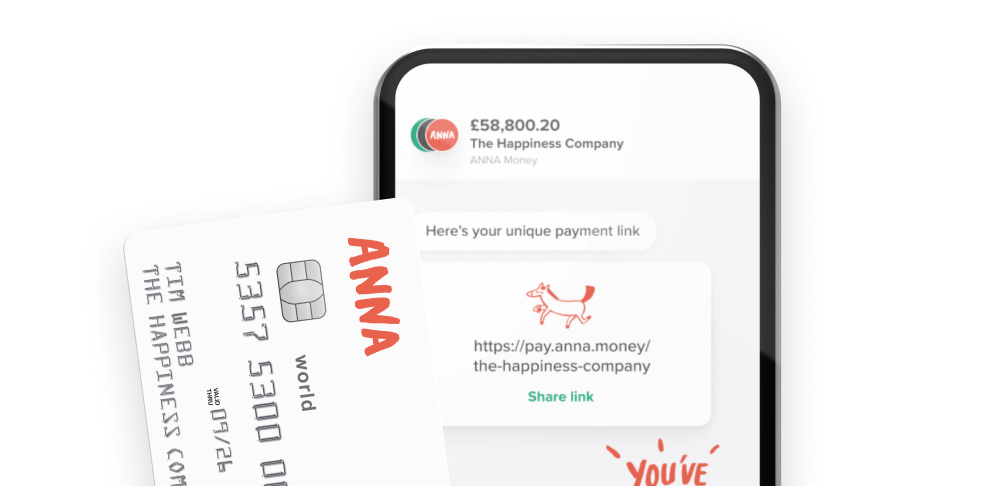
Open a business account in minutes
